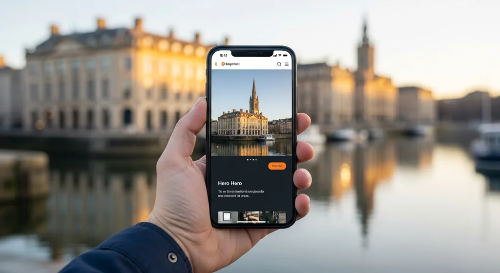
Open Google Analytics for almost any Bristol business and you'll see the same picture: 70 to 80% of visitors arrive on a phone. Yet most local websites are still designed on a 27-inch screen and quietly punished on the device most customers are actually using. That's what mobile-first web design is meant to fix.
In 2026, the reality is clear. The majority of your Bristol customers will interact with your website during their commute, lunch break, or while they're out shopping. If your site isn't made for mobile, you're losing out, on sales, enquiries, and local visibility. Mobile-first isn't just a trend, it's a necessity for any business hoping to connect with Bristol's fast-moving, phone-centric audience. In this guide, we'll break down what mobile-first really means, why it's especially important in Bristol, and how to spot if your site is falling short. We'll also walk through practical steps to improve your site and explain how Google and online ads react to poor mobile design.
What Mobile-First Actually Means
Mobile-first means the mobile version of your site is designed first, then expanded for tablet and desktop. Not the other way around. The goal is a fast, focused, thumb-friendly experience that loads in under 3 seconds and answers the visitor's question without them having to pinch, zoom, or rage-tap.
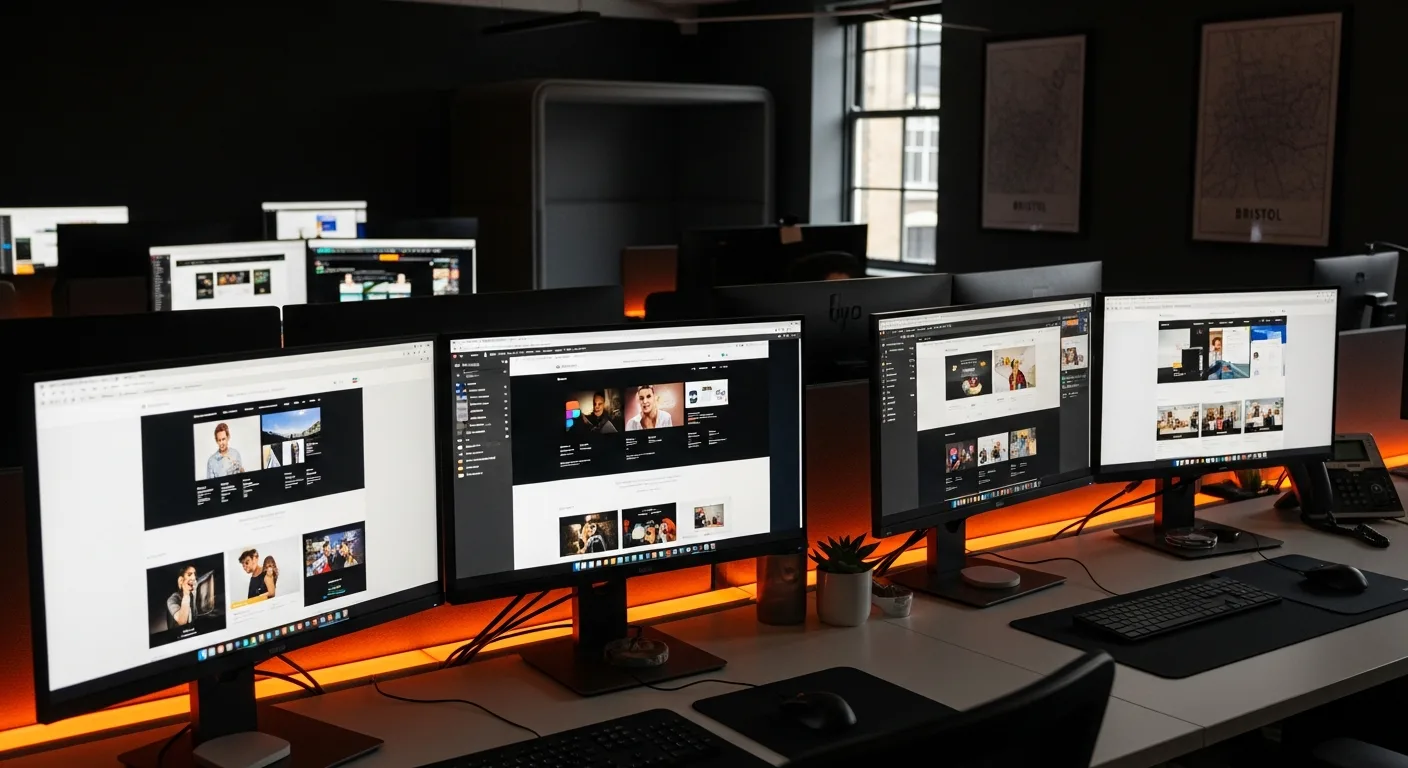
When web designers start with mobile, every element, from navigation menus to images and contact forms, is optimised for small screens, big thumbs, and unpredictable mobile data speeds. This approach forces you to prioritise what's most important: clear calls to action, concise content, and simple navigation. Rather than cramming everything into a desktop layout and hoping it survives the transition, mobile-first ensures your site works brilliantly where it matters most. Our team at Sitement sees too many Bristol sites built desktop-first, resulting in cluttered pages, unreadable text, and hidden contact details on phones. By reversing the order, you improve usability for everyone.
Why Bristol Customers Are More Mobile Than Most
Bristol's high streets are busy. Customers walk between Park Street, Cabot Circus and Gloucester Road searching for cafes, services and shops on their phones. They're often not at a desk, and they expect answers immediately. If your site can't deliver, the next result will.
Local behaviour backs this up. Bristol has a younger-than-average population and a strong tech culture, so browsing and shopping on mobile is second nature. Whether someone is hunting for a plumber, booking a hair appointment, or checking your menu, their first instinct is to Google it on their phone. If your site loads slowly or makes it difficult to find information, most users won't wait, they'll try a competitor. The expectation in Bristol is instant access, clear directions, and easy contact. Businesses that ignore this trend risk losing footfall and online enquiries, especially as mobile habits keep growing every year.
Google's Mobile-First Indexing
Since 2019, Google has indexed and ranked sites based on the mobile version, not the desktop one. If your mobile site has less content, slower speed, or a cramped layout, your rankings suffer even on desktop searches.
This is crucial for anyone relying on local search. Google checks your mobile site for page speed, content quality, and usability. If your mobile site is stripped down, missing important pages, or difficult to navigate, it will harm your search rankings across all devices. Many Bristol businesses find their desktop site ranks well in theory, but in practice, poor mobile experience pushes them down the results. This affects everything from local SEO to visibility in Google Maps. To stay competitive, your site must meet Google's mobile standards, which means fast loading, accessible content, and well-optimised layouts. Ignoring mobile-first indexing is a costly mistake for any Bristol brand looking to grow online.
5 Signs Your Bristol Site Is Failing on Mobile
- Slow load times: If your site takes longer than 3 seconds to appear on a phone, most visitors will leave. Test your site using both WiFi and mobile data to catch hidden speed problems.
- Text too small to read: Visitors shouldn't have to pinch or zoom to see your content. Font sizes under 16px are often unreadable on phones.
- Tiny buttons or links: If your calls to action are hard to tap, users will get frustrated and leave. Aim for buttons that are at least 44px tall.
- Hidden contact details: Your phone number, address, and opening hours should be visible without scrolling or searching. If they're buried in menus, you're missing valuable leads.
- Pop-ups and overlays: Intrusive pop-ups can block content and make it impossible to use your site. On mobile, these often cover the whole screen, driving away customers.
If you notice any of these issues when browsing your own site, it's time for a rethink. These common pitfalls are especially damaging for Bristol businesses, where competition and expectation are high.
- Your phone number isn't tappable
- Buttons are smaller than 44 × 44 px
- Text is hard to read without pinch-zooming
- Hero images push the call-to-action below the fold
- Load time on mobile 4G is over 4 seconds
What a Mobile-First Bristol Site Should Have
- Instant load speed: Your site should appear in under 3 seconds on most phones. Compress images, minimise scripts, and use local hosting for best results.
- Clear, visible calls to action: Whether it's "Book Now", "Call Us", or "Get Directions", buttons should be easy to tap and clearly labelled. Test with real users to check for awkward placements.
- Simple navigation: Menus should be easy to use with one thumb. Avoid complicated drop-downs and make sure the most important pages are just one tap away.
- Readable content: Use large font sizes, high contrast, and concise text. Make sure your information answers customer questions directly.
- Visible contact info: Your phone number, address, and opening hours must be easy to find. Consider adding a sticky header or footer for quick access.
For Bristol businesses, these features aren't extras, they're essentials. Mobile-first design provides a smoother experience, higher conversions, and better search rankings. If you're unsure how your site compares, check out our web design services or request a quick review.
- A single clear call-to-action visible above the fold
- Click-to-call and click-to-WhatsApp buttons
- Optimised images served as WebP
- A sticky bottom-bar nav for one-thumb use
- Local schema (LocalBusiness, Geo) in the head
How to Test Yours This Week
Open your site on your phone. Time how long it takes to load. Try to find your phone number, your services, your location, and your opening hours, all using one thumb. If any of those took more than two taps or felt awkward, you have work to do. Try our free audit tool for a more detailed breakdown.
If you want a deeper check, ask friends or staff to do the same and report any frustrations. Tools like Google's Mobile-Friendly Test and PageSpeed Insights are helpful, but nothing beats real-world feedback. Also, check how your site appears in local search results and Google Maps listings. If your information doesn't show up or appears incomplete, that's a sign your mobile site needs attention. For urgent fixes or a professional review, our team can help via contact.
Frequently Asked Questions
Is mobile-first the same as responsive?
No. Responsive design means a site adapts to various screen sizes, rearranging layout and content as needed. Mobile-first goes further, starting with a design optimised for mobile users and then scaling up for larger screens. It's about prioritising mobile usability from the outset, rather than just making a desktop site fit smaller devices. Both are useful, but mobile-first is essential for Bristol businesses with a mostly mobile audience.
Will switching to mobile-first hurt my desktop experience?
Not if it's done well. A properly executed mobile-first web design ensures that content and features scale up smoothly for desktop users. In fact, it often leads to cleaner layouts and more straightforward navigation on larger screens. The key is thoughtful planning, your site should remain fully functional and visually appealing across all devices, whether it's accessed on a phone, tablet, or desktop.
How much does a mobile-first redesign cost in Bristol?
If you're starting from scratch, expect to pay between £2,500 and £6,000 for a full mobile-first web design from a reputable Bristol agency. Optimising an existing site for mobile usually costs £500 to £2,000, depending on complexity and the amount of work required. Pricing varies based on the size of your site, the level of customisation, and whether you need extra features like booking forms or ecommerce integration.
Can I make my existing Bristol site mobile-first without a rebuild?
Often yes. Many improvements can be made without a full rebuild, including a targeted mobile UX audit, optimising images and code, adjusting layouts, and adding larger tap-friendly buttons. Updating your navigation and contact info visibility also makes a big difference. These changes can transform the mobile experience and boost conversions, saving you time and budget compared to starting from scratch.
Does mobile-first affect Google Ads?
Yes, hugely. Google Ads evaluates your landing pages for speed, usability, and relevance, especially on mobile devices. A slow or awkward mobile site will lower your Quality Score, making your ads less visible and increasing your cost per click. Improving your mobile experience helps your ads perform better, reduces wasted spend, and attracts more Bristol customers looking for local services.
Want a Mobile UX Audit?
Our team will benchmark your Bristol site on real devices and send you a prioritised list of what to fix, free.
Get a Strategy ReviewGet in Touch
Tell us about your business and what you're looking for. We'll come back to you with a straight answer.